ENTROPOL’s New Identity: Modern, Dynamic, and Inspired by Aviation
Since the day we were founded, ENTROPOL has placed innovation and engineering excellence at the core of everything we do. After more than a decade, we have taken another bold step forward: we have redesigned our logo and corporate identity to better reflect our modern, global, and digital-first approach.
🔄 The Story Behind the Change
Our logo has always been more than just a visual element – it’s been a symbol of our values and vision. But in the past 10+ years:
-
Our business areas have expanded,
-
Our international presence has grown,
-
Our digital platforms have become central to our operations.
We realized it was time for a simpler, more modern, and globally recognizable identity.
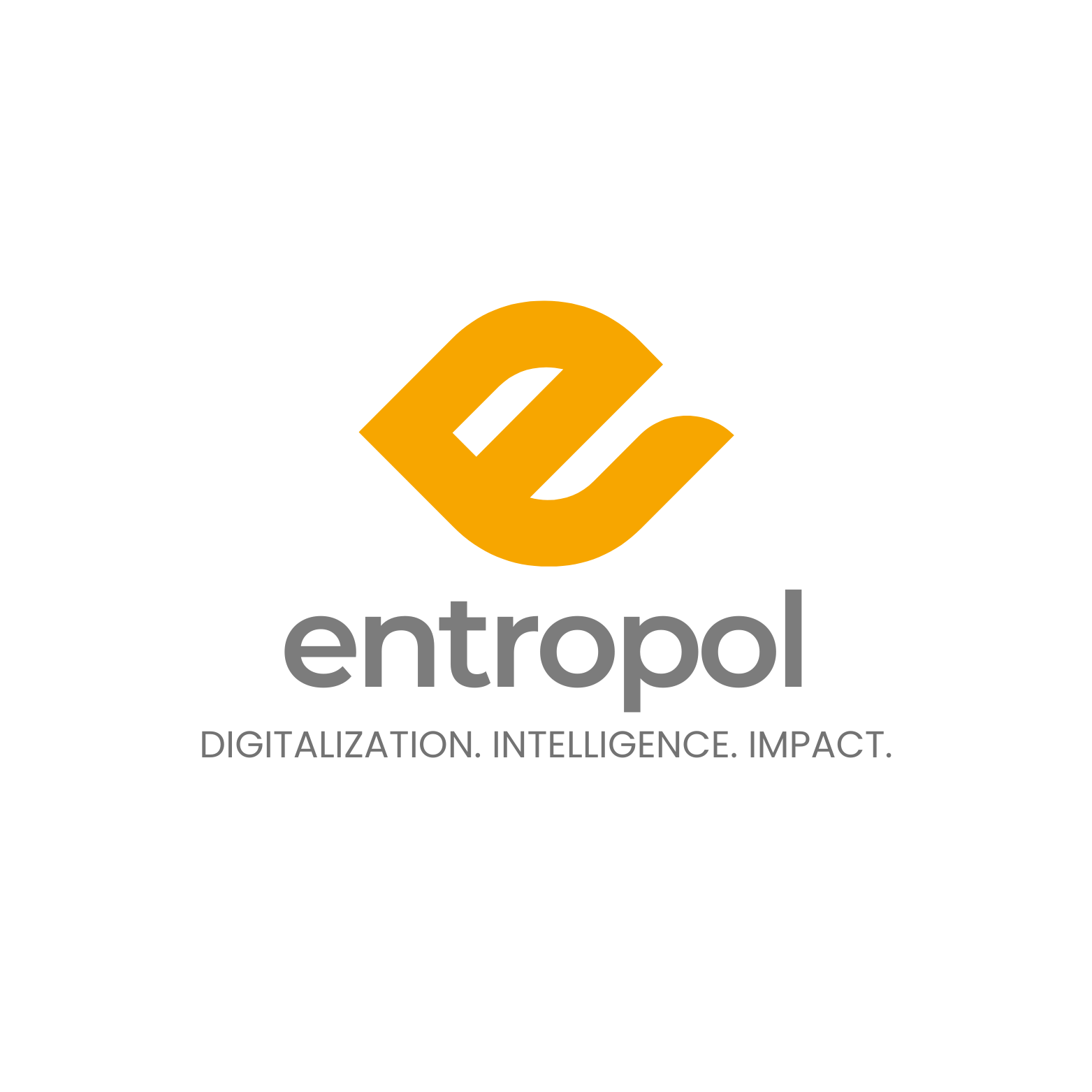
🎨 The Details of Our New Logo
While keeping our corporate colors intact to maintain our brand heritage, we have softened the typography for a friendlier, more approachable, and contemporary look.
-
The “e” Inspired by the Candle Flame:
In our old logo, the small flame above the “l” has now been reimagined as the lowercase “e” that becomes our new emblem. -
The Flying Crane Symbol:
The emblem is not just a letter – it represents a flying crane, a symbol of freedom, elegance, and continuity, perfectly reflecting our role in aviation.
💻 Digital & Print Adaptability
Our new identity is designed to look perfect across all channels:
-
Sharper and more legible on websites, social media, and apps,
-
Recognizable and clear even on mobile and small formats,
-
Consistent on printed materials such as business cards, letterheads, and presentations.
🚀 A Vision for the Future
This is more than a design update – it’s a reflection of ENTROPOL’s vision for the future.
-
Leading digital transformation,
-
Turning data into intelligence,
-
Delivering innovation and impact in aviation and engineering.
🙌 Join Us on This Journey
With this new identity, we aim to build an even stronger and more meaningful connection with our partners, customers, and followers.